Illustrator Tutorial: How to use the pen tool to make vector images
By Bungle
It seems using the pen tool in Illustrator (or equivalent)
seems to confuse a lot of you. But mastery of this tool (anchor points
in particular) is your key to Illustrator dominance! While I am in
no way a master, I’ve made this tutorial to help the less experienced
out. I have aimed this tutorial at the real Illustrator beginner,
so hopefully anyone will be able to understand.
Okay, I am going to show you how I do a very simple
stylised traceover of an existing object (in this case, some eyes)
into a stencil suitable image, as it is a nice way of showing how
the pen tool works.
**The eyes source image can be found here.
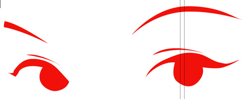
And what you are trying to create will look something like this:
1. First we have to import our source image. Take it into
illustrator (File > Place). Rescale it to fit your workspace, then reduce
the transparency of the image to about 80% (so you won’t lose your cursor
over flat black bits). Lock this layer so you won’t accidently move it
around while working.
2. About the pen tool – This is what you use
to create your own shapes in illustrator. You start a shape by clicking
in the workspace, then click somewhere else and a line will be created between
the two points. Every subsequent click will create another line from your
last point. Clicking on the original point will close the object.
Also, once you have three or more points a fill will
be created in the space inside the object.
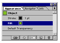
You have two main options for your shape you are creating:
stroke and fill. Stroke is the line you have created around your object,
while fill is obviously the colour or pattern inside your object.
3. Create a new layer; this will be your working layer. What
we are going to do do is make a one colour, vector version of what we have
in front of us. Select the pen tool (P), and make sure that
the appearance (shift + F6) and colour (F6) palettes are both open. Select ‘stroke’ in
the appearance palette, and in the colours palette click the Stroke
mini palette down the bottom.
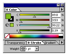
Here you can choose the weight (width) of the line.
Select a width of .25, which will create a very thin line. Now select ‘fill’ in
the appearance palette, and click ‘none’ (the white square with
a red line through it). This means your object will have no fill, which is
what we want at the moment. Now you’re ready to start making your first
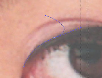
object.4. Now, back to the eyes. Basically we want to trace over the blackest
parts of the image. We’ll start with the eyelid on the right eye. Click
on the corner of the eye to create the first point, then click again around
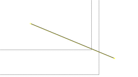
a third of the way up the eyelid. Now, if you left it as it is you would just
have a straight line, but what you want is a curve following the curve of the
eyelid. Delete the shape you just created. Start again, but this time when
you click the second point don’t let go of the mouse button.
Now if you drag the mouse around the screen with the button depressed, you
will see the line will curve depending on how much you move the mouse.
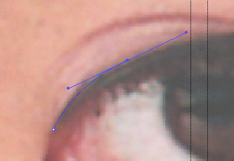
Experiment till you get a curve which matches the
curve of the eyelid, then let go of the button. Congratulations,
you’ve created your first bezier curve! If you aren’t happy with
your curve you just made, you can use the selection tool (V) and click and
drag the anchor points (the extra lines with squares at the end out of the
point you just made) around to fix it.5. Make another point anywhere you
want, but this time don’t click and drag to make a curve. You will
notice that the line you just made will still curve even if you don’t
want it to, and may produce an unexpected shape.
This is because the first curve you created has to basically ‘finish
itself’. Imagine that the curve between your first two points is a car,
and the more extreme your curve is, the more momentum/speed it builds up. As
such, it can’t just stop dead and go exactly where you want to the third
point, but must travel a certain distance (stopping distance) before it can
stop. And this stopping distance may go past the point you want, and it will
need to travel backward to get to it.6. Okay, that was a pretty crap metaphor.
See if you can do better, eh!
7. Anyway, where was I? Right, tutorial. Undo what
you just did (ctrl+z, or apple+z), so we’re back to the first two points. Now,
you have two options. You can either try and guess where the momentum from
the first curve will take you and put the next point where it should end
up (this gives you a natural looking curve, but requires experience with
the pen tool); or you can cancel out the momentum by alt-clicking on the
last point (note: you can’t do this in a car). Then you can continue
making the next point as normal. Either way, continue making points until
you get to the end of the eyelash.
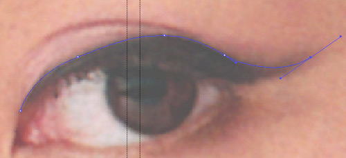
8. Keep in mind that to keep the most natural looking curve, use
as few points as possible. Once you get to the end of the eyelash
you will most likely need to alt-click your last point, as you need to go
backward and have a nice sharp corner. Now go back tracing the underneath
of the eyelid (ignore the actual eye for the moment) and when you get back
to the start click your very first point point. This closes the shape and
makes it complete. Your first object is done!
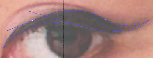
9. Now you need to trace over everything else you want in
the same way. I traced over the aforementioned eyelid/eyelashes, the actual
eye itself, the crease where the eyelid meads the face and the eyebrows. You
can add more or less detail as you like. Remember (especially around the eyes)
to use as few as points as possible to keep everything smooth. Remember that
because you are making a stencil you just want the highest contrast areas...
you just want to capture the essence of the picture without getting too much
unneccesary detail.
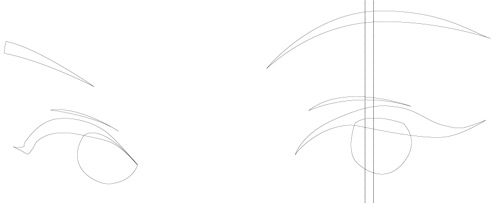
10. Once they are all done, hide (the little eye icon to
the left of each layer) the layer with the source image so you can just see
the shapes you’ve made. It should look something like this:
11. Now you just need to fill the shapes with colour. Select ‘fill’ in
the Appearance palette, then click the colour of your choice (bright red is
a fun and popular choice). You want to get rid of those unsightly black lines
too, so select ‘stroke’ in the Appearance palette, and select ‘none’ (white
box with red line through it, just like at the start) in the colour palette.
12. You’re done! Now you can take
your brand spankin’ vector eyes into photoshop for some fresh stylin
PST, print it out and hit the streets, or whatever tickles your fancy.
Search The Site
Browse desktops by category: